Palo Data Visualization
Design Systems, Data Visualization
Client
Years
Palo Alto Networks
2023-2025
Problem Statement
Multiple product teams used bespoke data visualization libraries with overly colorful categorical palettes that conflicted with semantic colors and lacked consistent accessibility standards. An earlier attempt to create a unified library had been deprioritized due to a lack of resources, leaving designers with incomplete beta components that resulted in detached and custom workarounds.
Audience
Product designers across 30+ cybersecurity applications and their end users — security analysts, sales engineers, and enterprise administrators who rely on clear, accessible data visualizations to make critical security decisions.
Role
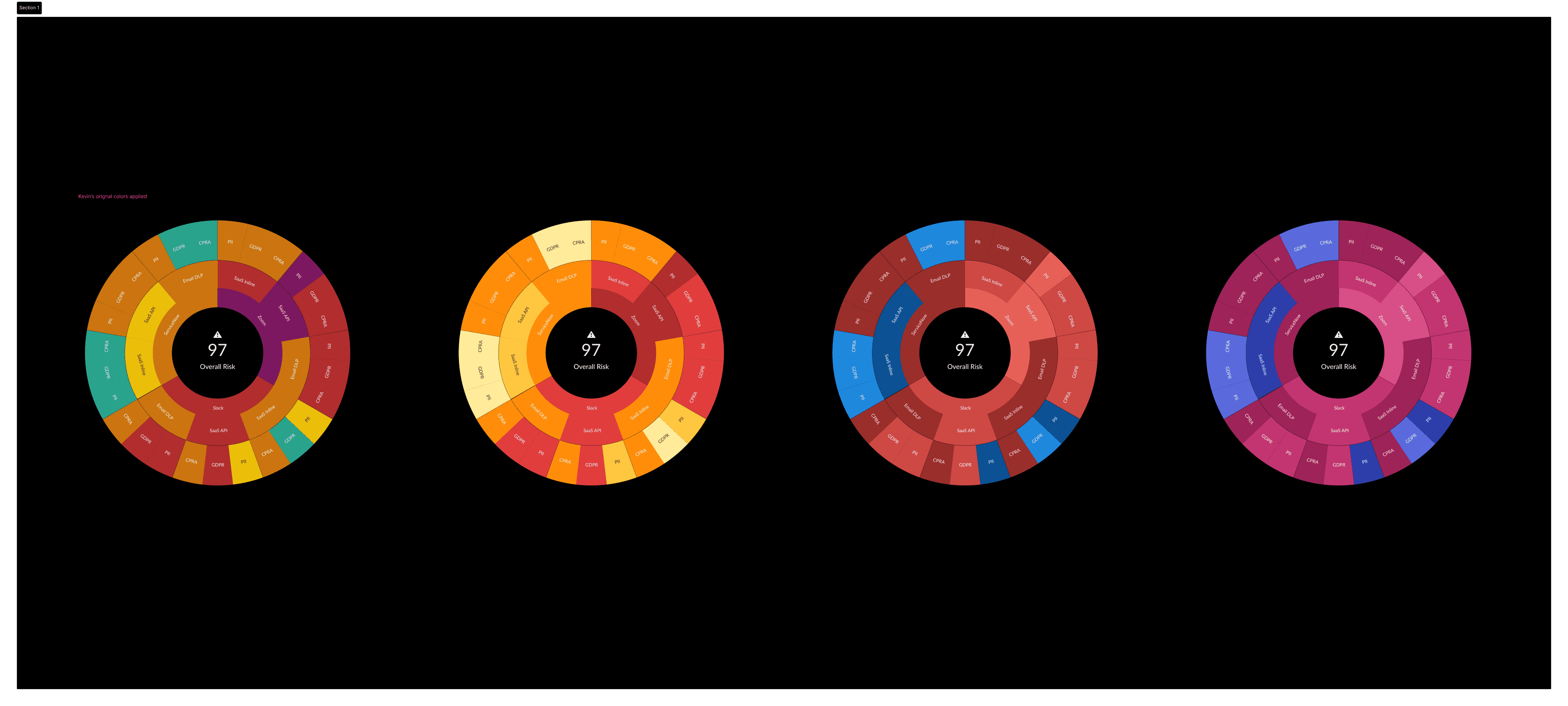
As Design Systems Lead, I defined and created the data visualization color palettes and semantic color palettes, with comprehensive documentation. I collaborated closely with a data scientist to ensure technical accuracy and with a lead researcher to validate semantic color interpretation. I led the enhancement and consolidation of multiple chart components and their structure, navigating stakeholder conflicts while maintaining focus on designer adoption and accessibility. I balanced leadership requests for "cooler" color schemes with product team needs, ultimately delivering solutions that achieved cross-functional alignment.
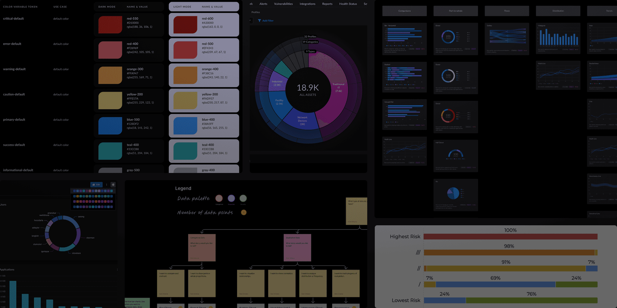
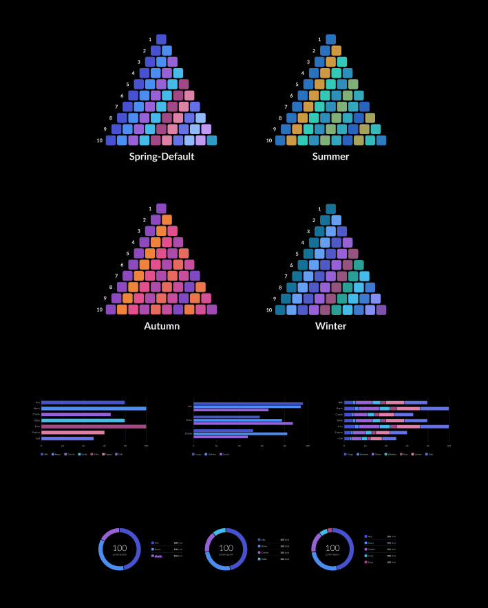
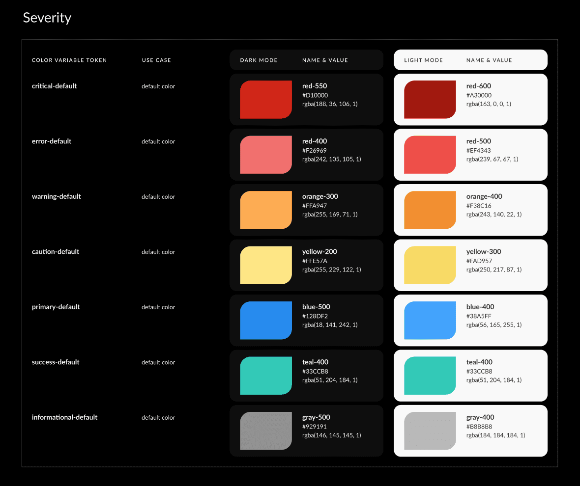
Colors
I crafted four seasonal categorical color palette families, harmonizing brand consistency, accessibility (WCAG 2.2), and user customization. I also aligned the severity semantic meaning across a dozen different scales and product use cases.
Components
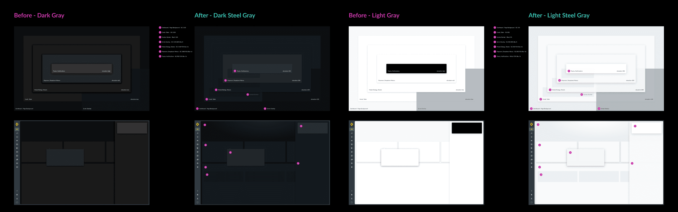
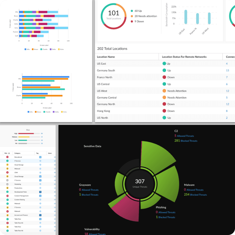
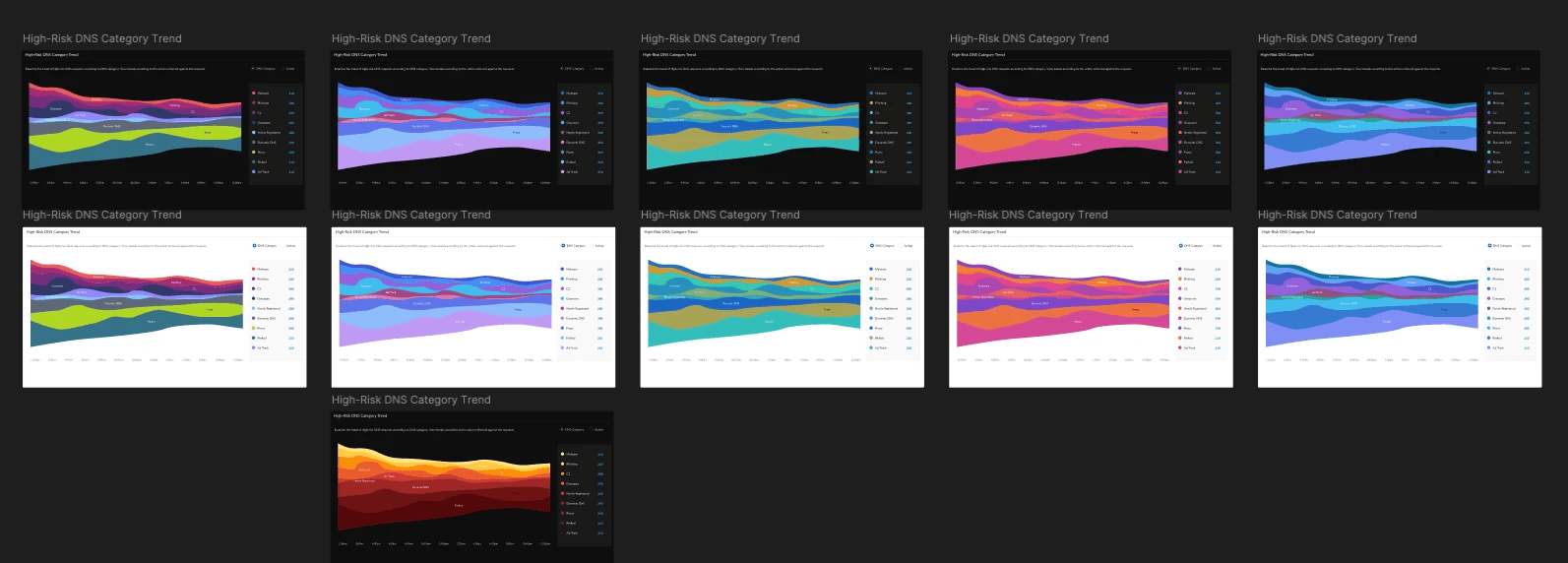
I established a consolidated data visualization chart library with comprehensive component variants, eliminating the need for designer workarounds.
Tokens
A scalable color token system was designed and helped support cross-platform consistency and future expansion.
Documentation
I delivered a simplified sticker sheet and a concise matrix focusing on practical implementation over exhaustive technical details, impacting designer efficiency and ease of use.
Architecture
I streamlined and enhanced the data visualization component architecture with flexible, adoption-ready variants.
Outcomes
The unified Palo Data Visualization library launched on schedule in parallel with a critical feature release, enabling users to customize data displays with differentiated categorical palette options. By prioritizing usable components and coordinating with strategic product launches, the library achieved adoption momentum. The accessible color families resolved semantic color conflicts while improving usage for users with color deficiencies. This foundational work reduced technical debt, streamlined designer-developer handoff, and directly enabled new product capabilities that enhanced user experience and market differentiation.